
Hardline Interactive
Brand
The Hardline Interactive logo, colours and type, ready to use. For press, creators and anyone writing or making something about the studio or its games.
Logo
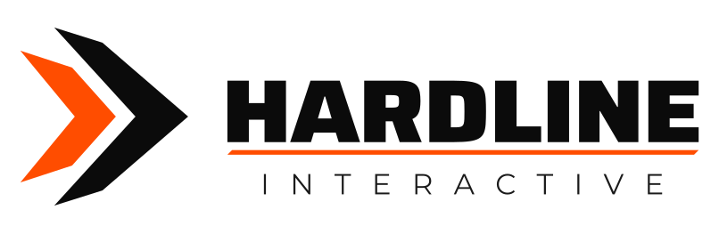
Four forms of the same mark. Use the full-colour logo wherever you can; the one-colour versions are for when colour isn’t an option.
Colours
Hardline Orange and Hardline Black are the pair. Click a colour to copy its hex code.
Typography
Hardline
Saira
Saira, Expanded Heavy (weight 850, width 118%), in capitals. For the name and headlines.
On Google FontsInteractive
Montserrat
Montserrat Light (weight 380), widely tracked, for labels like INTERACTIVE. Regular and Medium for body text.
On Google FontsBoth are free, under the SIL Open Font License.
Using the logo
Clear space
Keep a margin at least the height of the small chevron on every side.
160 px

16 px
Minimum size
Horizontal logo: at least 160 px (40 mm) wide. Icon: at least 16 px (6 mm).
Do
On black
On white

On orange
Don’t
Stretch or squash it
Recolour it outside the palette
Rotate it
Move the orange underline
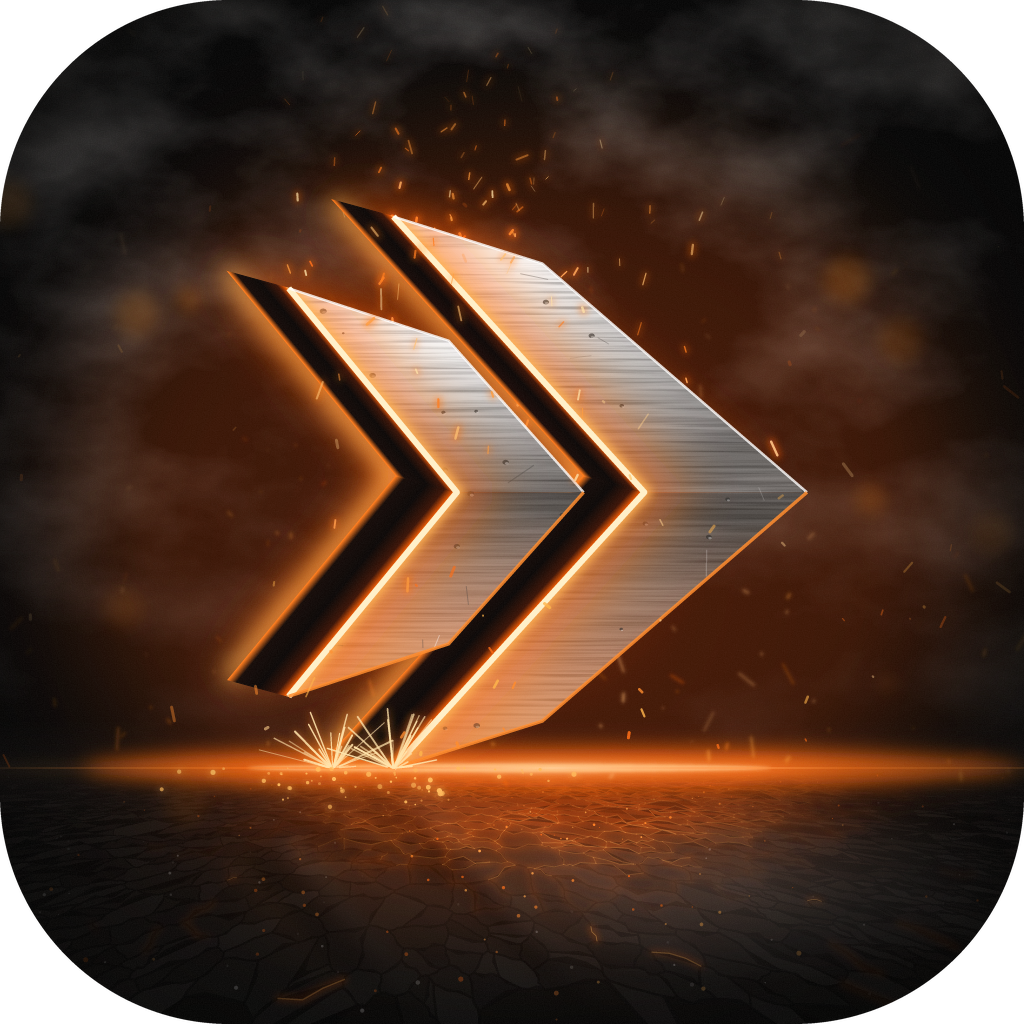
App icons



Wallpapers
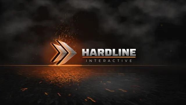
Desktop, 2560 × 14404.5 MB
Desktop, 2560 × 14402.7 MB
Desktop, 2560 × 14400.5 MB
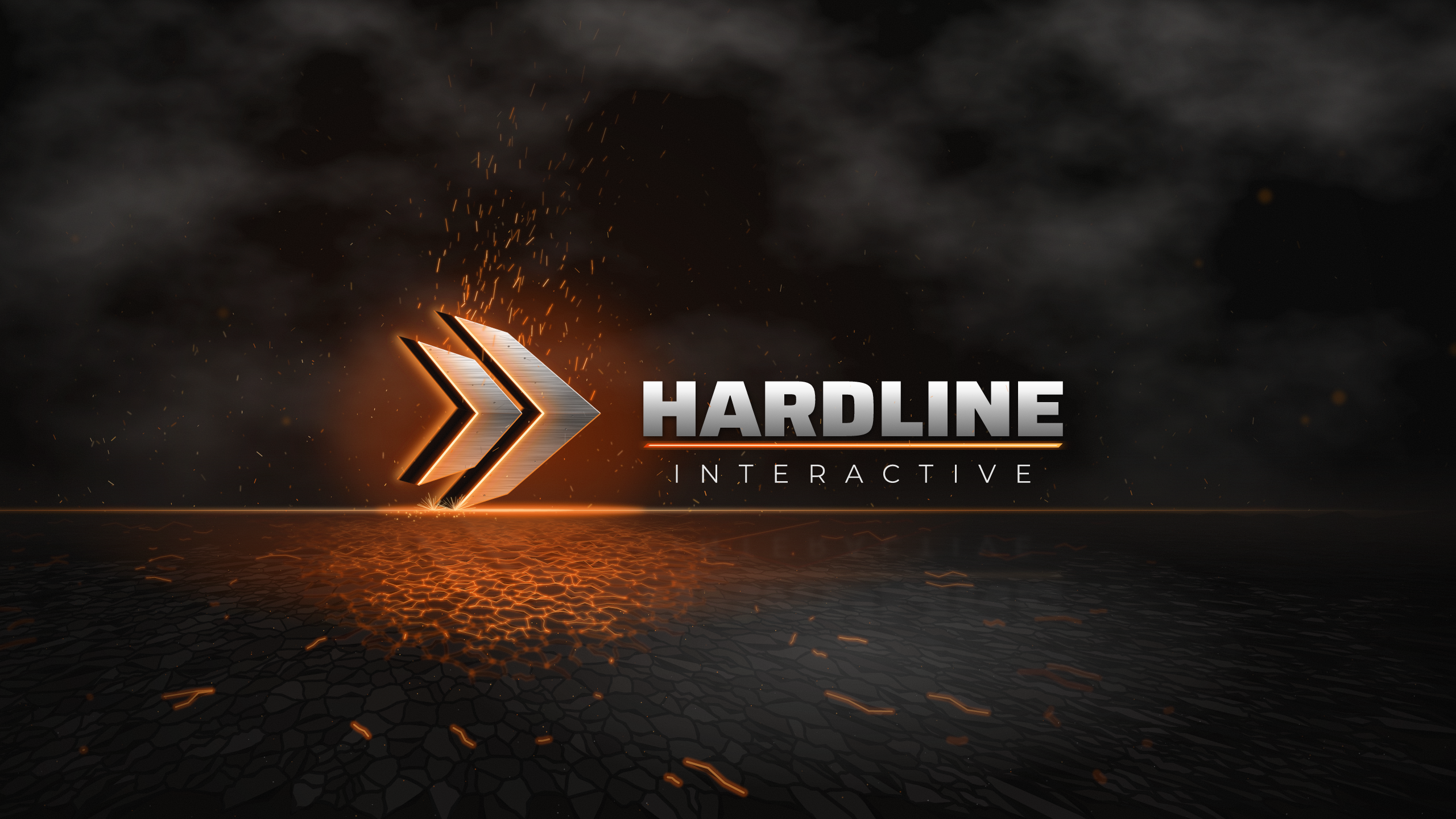
Phone, 4.7 MB
Phone, 2.6 MB





A word on using these
Use these to talk about Hardline Interactive and its games. Please don’t use them to suggest the studio made, sponsors or endorses something it hasn’t. Questions, or need a format that isn’t here? Email press@hardlineinteractive.com.